|
The idea for Summer
of the Karmann Ghia (1998) actually came to Pratt in the
early 1970s. Initial studies were made for it, but were then put aside.
After a fire burned down his new studio in 1992, Pratt revisited some
of these old studies, one of which was Summer of the Karmann Ghia.In
reviewing these, Pratt decided that lithography would be the most appropriate
medium for the image.
Like any of his works,
the first step in completing Summer of the Karmann Ghia
was the study process, which in this case spanned a period of time, off
and on from 1973 to 1998!
Summer of the Karmann
Ghia is a colour lithograph. Making a polychromatic lithograph is more
complicated than a monochromatic one, which uses only one colour of ink.
Each colour to be used in the final work requires a separate plate and
the artist must be conscious of how colours will overlap to create new
colours. The artist must also be able to envision how the individual shapes
and colours of each plate will fit together in the final image. This is
one part of the process where studies may be extremely helpful.
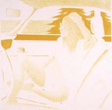
The first plate printed was the yellow. Grease in pencil form was
applied to the plate in the areas where Pratt wanted to print yellow
pigment. The plate was then treated to lock the pencilled areas in
place and a yellow, oil-based ink rolled on. The ink adhered only
to the greasy areas, and was transferred to the paper by the pressure
of a press. Registration marks were placed on the paper and on the
plate to ensure that each plate would be correctly lined up with the
image as other colours were added. |
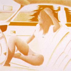
The process was then repeated with a second plate drawn to print the
red pigments. Where the red and the yellow colour overlapped on the
paper, the image appeared orange. The combination of the red and yellow
plates was used to print much of the figure's skin tone and the colour
of her hair. This two-colour stage is called a 'state proof'. |
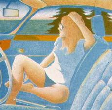
The third plate was rolled with a blue ink. It was then lined up with
the registration marks on the papers and the plate pressed to add
the blue pigment to the prints already printed with yellow and red.
The image now contains red, yellow and blue pigments. Where the blue
colour and the yellow overlap, the image appears green (the trees
in the background, for example). The blue colour fills in much of
the car's interior and forms the basis of the shadows in the picture.
It is, of course, also responsible for the colour of the ocean in
the background.
|
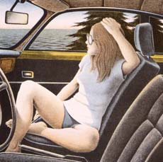
Finally, the black plate is printed. This plate adds definition and
detail to the print and is responsible for the darkest areas of the
print. Because of the relative opacity of the ink used, if black overlaps
a colour previously printed, the colour underneath may not be seen.
However, in the areas of any plate left open (that is, with no or
very little grease), the previous colours will show through, creating
interesting effects of colour and texture.For example, vertical lines
were left open - with no grease - in the seat area on the black plate.
When printed over the blue plate, it appears that the sun is highlighting
shiny blue areas of the vinyl seat of the car.
|
The combination of
all these separate plates resulted in the finished print. They also create
the particular chroma, or colour scheme, that Pratt intended. In other
works, such as Above Gander Lake (1998), the colour purple
is used instead of black to capture the look the trees would have at dusk.
return to lithography
return to process/media

|