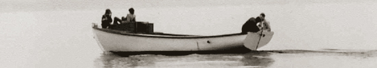

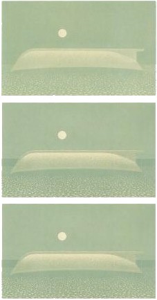
Studies for "A Boat and the Moon"
| After Christopher Pratt decides that silkscreen printing is the most appropriate medium for an image, the technical process of making the print come to life must take place. He starts with approximately 100 sheets. Many of these will be used for trials and proofs; some are lost to mishaps and accidents. The survivors comprise the edition, which may number anywhere from 7 to 70. Proofs are a very important part of the technical process of printmaking. It is through these proofs that an artist can see where his work is going, and can plan further adjustments to the image. This is especially important for Christopher Pratt: because he uses only one screen, the stencil just printed must be erased in the preparation of the one to follow; there is no going back. The following example of a silkscreen print, A Boat and the Moon, was created in 1991 specifically for inclusion in the catalogue raisonnée for a retrospective exhibition of prints. What follows are Pratt's own words regarding the nine state proofs shown, starting with a proof of the first pull of the squeegee across the screen and ending with the final, editioned, print. These descriptions will give you an idea of the process of developing a silkscreen image. |
|
|
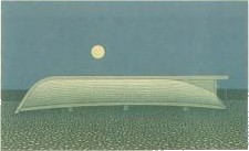
 State 2 The second stencil printed a slightly cooler, darker priming glaze over state 1, leaving the lighter tone showing only in the moon and along the top edge of the keel. I wanted the moon to be specifically "The" moon, not "A" moon - not just a symbolic disk in the sky area, so I printed something resembling its surface detail with this stencil. |
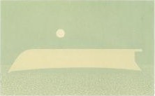 State 3 The third stencil printed a green undertone over everything except the moon, the boat and the lightest beach rocks - things that should read as white or be highlighted in the finished image. |
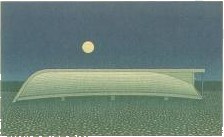
 States 4, 5 and 6 The next several stencils - five in all, developed the shape and form of the boat and defined the keel and the skeg; they also added to the detail in the beach and darkened the sky. I used a transparent paint, which printed a warm grey over the boat, but darkened the greens in other areas. I also strengthened the detail in the moon with one of these stencils. It had started to get lost as the sky darkened. |
 State 7 This stencil - the ninth - printed a more opaque blue-grey colour in the sky. It also printed the detail in the boat and strengthened the beach and water. |
 State 8 I used two successive stencils to darken the sky and the water, stippling with glue to get the "glow" at the horizon and some texture in the sky. |
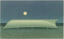 State 9 The twelfth stencil printed the dark shadow under the boat and the detail in the water. Three weeks and twelve stencils after State 1, I "call it a day!" |
| return to process/media page return to silkscreen process |